Wednesday, August 29, 2012

Prophet #28: Live Free or Die Hard

Prophet #28
Story: Brandon Graham with Giannis Milonogiannis and Simon Roy
Art: Giannis Milonogiannis
Colors: Joseph Bergin III
Aug 29, 2012
Image

Disclaimer: if you haven't read the first 7 issues of Prophet stop reading now. Go to Amazon.com, do yourself a favor, and buy Prophet Volume 1: Remission. It costs $10, and contains six issues of one of the best comic stories of the past decade.

There.

Now for the rest of the Prophet faithful (or those who just need some more convincing that a Rob Liefeld concept could possibly be worth their time), let's dig into this issue and see what Graham and co. have in store for us this month.

First off, let's talk about the cover. Look at that cover! Yes, it's a redesign of the original cover to Rob Liefeld's Prophet #1, only with a cro-magnon looking Prophet who is more like the clone we first meet in issues #21-23. Look at how intense and violent he is, with a knife and arrow stuck into him, and sharpened bones strapped to his back.

If you'd never read Prophet before, you'd probably think "man, this issue looks totally EXTREME!"

Settle down, 90s kid, this issue is nothing like that.

No, this issue continues the story from #27, as Great Grandfather Prophet and his Kinniaan friend Brother Hiyonhoiagn travel towards Earth while gathering up the scattered parts of their mechanical comrade, and former Youngblood member, Die Hard. In the early issues of this series, it was very unclear where it was going and what it was about. The first three issues had a fairly straightforward narrative, but as more and more facts about the greater context of the story emerged, it seemed to be a much more insignificant part of a larger  narrative fabric.

With issues #27 and #28, I finally feel like Brandon Graham and his co-creators are making the direction of this series much clearer than it has been, with the original John Prophet, the Great Grandfather to the Earth Empire's clone army, travelling the galaxy and searching for his friends from the last great war, as the Prophet clones work towards reviving the Earth Empire.

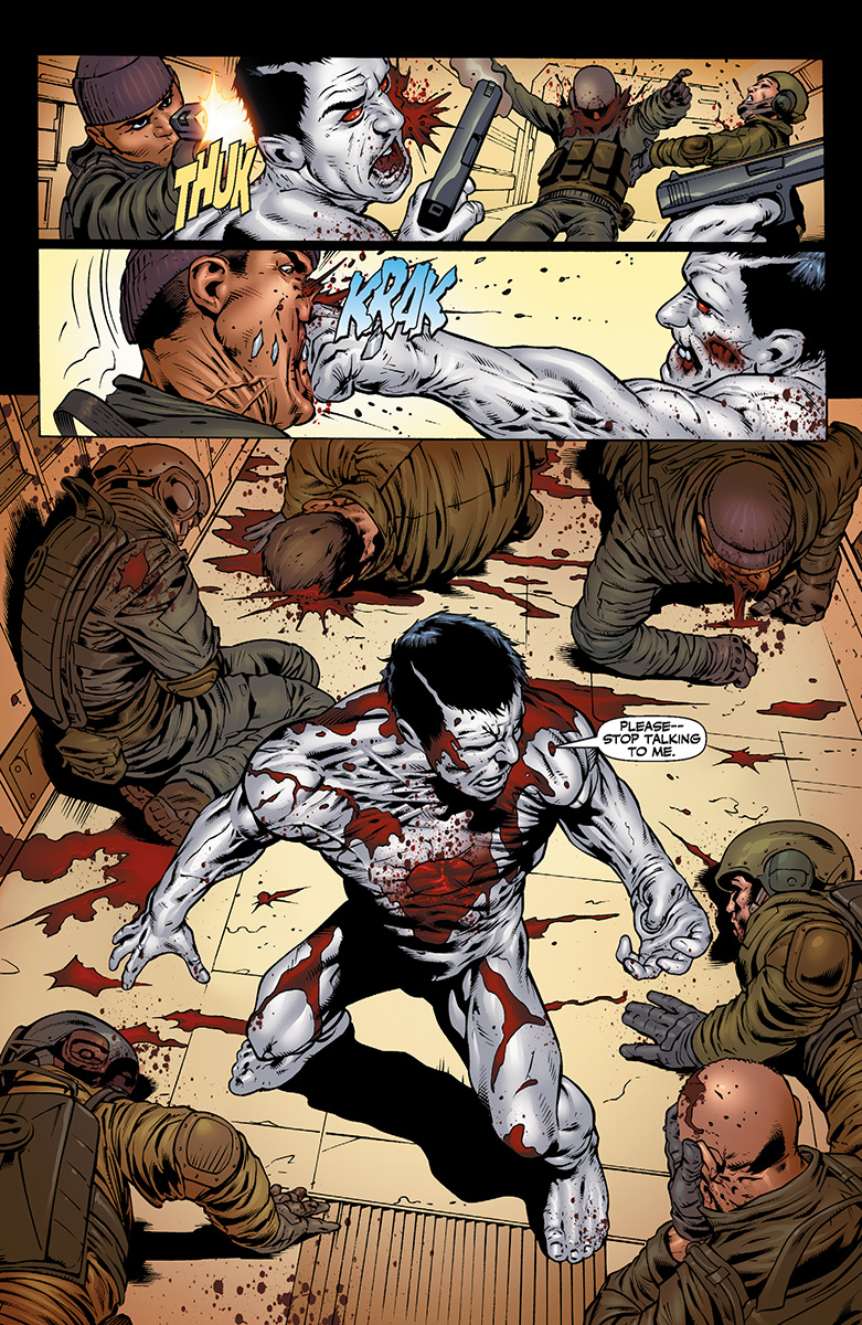
The emergence of John Prophet from the drill-pod in the first issue signalled the arrival of the Prophets as an almost violent incursion on nature itself. The very first thing he does is brutally kill a natural predator with an Empire knife. The world of Prophet is one that has moved beyond humanity, and is the better for it. My point is, the return of the Earth Empire is signified through violent action and a disturbance of the natural order.

The Old Man Prophet seems to know this also. I think it's particularly telling that of all his companions we've seen so far, Brother Hiyohoiagn, Die Hard, the robot from #26 and the lizard lady from the last issue whose names I can't remember, none of these characters are human.

So what about this issue? Well, the art continues to be excellent. I know that some Prophet fans prefer Simon Roy's work on the title over Giannis Milonogiannis' manga-inspired artwork but personally, I think his style perfectly fits the austere, poetic narrative that accompanies Old Man Prophet's adventure. Also, it's easy to overlook what a great job that Joseph Bergin III is doing on the colours with this book, but you really should, because the colour of this book contributes so much to its tone.


Another interesting thing about this issue is that we learn more about the Dolmantle. The Dolmantle, if you'll remember, is the sentient, blue, slimy thing that the first Prophet used as a breathing mask, as a glider, and even to re-attach a lost limb. I always thought that something was strange about the Dolmantle (besides all those things I just listed), and in this issue we learn that the Dolmantle can exert mental control over its host, as it does to Diehard's missing warbody. This means that in the first three issues, it must have been the Dolmantle which was pushing the first Prophet clone to reach the God satellite at the top of the Thauili Van.

I have a feeling we have much more to learn about the Dolmantles and their connection to the Mothers and the Earth Empire, but it was nice to start seeing more connections to the earlier issues.

I have never read a Youngblood comic in my entire life, but due to its depiction of Diehard, Prophet #28 makes me want to.

I seriously did not mean to spend this much time talking about Prophet #28. It's but a small chapter in a larger post-human space epic. Buy it now and experience a comic book run that fans will be discussing for decades to come. This is rare, excellent stuff.

Captain Marvel #3: We're Here; We're Waiting

Captain Marvel #3
Writer: Kelly Sue DeConnick
Artist: Dexter Soy
Marvel
August 29, 2012

I decided to keep following Captain Marvel, in spite of the problems I had with the first issue.  I've heard a lot of good things about DeConnick so I wanted to give her the benefit of doubt and keep reading.

It's paying off.  I've been increasingly impressed with the character development of Captain Marvel, including her stubbornness and her inability to back down from a fight (sound familiar, Christian?).

At first, when Captain Marvel spares an enemy pilot from a vicious beating, you're thinking, "Oh ok, so she's straight edge--a little like Captain America.  She won't kill the bad guys; she'll just give them a good beat-down."  But then she tells him to go back to camp and gather up the best army he can muster.  She says, "...when my gals and I hand you your asses...I want you to know beyond any shadow of a doubt...it could not possibly have gone any other way."  And that's when you know that Captain Marvel is completely bad-ass. 

The plot is taking its time to reveal where exactly it's going but it's certainly shaping up.  Characters and plot points that seemed unattached in the first issue are coming around again in the third.  Let's just say, I think there's going to be another pilot in the mix sometime soon.

The only thing, story-wise, that doesn't make sense to me is how there is a half-Japanese soldier in the US army during World War II.  Correct me if I'm wrong but were Japanese people allowed to join the army to fight against their own countrymen?  I guess that's not really the point in the comic book world but the blend of comic book world and real world in this series is a little confusing.

The art style is growing on me.  I have to say that I was thrown by it a couple times in the second issue because the background tends to look more realistic than the characters in the foreground.  The blend makes for a rather jarring splash page.  However, the sharp lines and dark colors lend Captain Marvel a determined, not-to-be-f***ed-with-air about her.  I also really appreciate that she, as well as the Banshee Squad, are drawn as athletes.  Sure, they have hips and boobs, but man, do they have rippling muscles as well!  The action shots really emphasize their movement and their physical presence and power, rather than their body parts.

The interlude is totally enticing--I can't wait for Captain Marvel to look up "Cobb, Helen" in the book.  All in all, "We'll be here.  We'll be waiting"...for the next issue!

Monday, August 27, 2012

Advance Review: X-O Manowar #4

X-O Manowar #4
"Then and Now"
Writer: Robert Venditti
Artist: Cary Nord
Inker: Stefano Gaudiano
Colourist: Moose Bauman


The flagship title of the new Valiant Universe continues this week as Aric of Dacia finds himself faced with an armed response to his sudden arrival in the modern age. Robert Venditti and Cary Nord’s relaunched X-O Manowar series has been excellent so far, and from an action perspective, this issue once again delivers as Aric shows off what the Manowar armor can do when faced with modern military hardware. 

Storywise, Venditti continues to develop the schism within the Vine as the religious and military factions disagree about what to with our time-displaced protagonist. We also get to see a meeting between the Vine admiral and what I’m assuming are the descendants of the Vine babies we saw in Issue #1; a scene that seems to be sowing seeds of unrest among the Vine’s sleeper agents that have been stationed on Earth.

Despite how great it was to see the Manowar armor in action again, I found the scenes between the Vine factions in this issue to be the most intriguing. As antagonists, The Vine are a vast improvement over the Spider Aliens  from the original series, as their motivations are not completely black or white( or even really all that known to us, yet) and their culture is much more nuanced. I feel like we still have a lot to learn about this alien race, but Venditti is keeping the real progression of his story a secret, as small layers are revealed to us issue by issue.

If I have one minor gripe with this issue, it is this: when Aric rips the pilot of the Eurofighter out of his jet and demands he tell him where the Emperor is, he speaks to the pilot in English and the pilot responds IN ENGLISH. First of all, they are in Italy, and the pilot is Italian, ergo, they should be speaking Italian. Secondly, Aric of Dacia is a Visigoth. His language predates English by more than a thousand years! I'll have to re-read the first few issues and see if there was any indication that the armor was working as a translator, but as I was reading this issue this really bugged me. 

This is extremely nitpicky, I know. I should be able to use my suspension of disbelief when reading a comic about a barbarian in power armor fighting aliens, but in the original series they made a big deal out of the fact that once he entered the modern era, Aric had to actually learn how to read and speak English. He was an uncultured, violent, illiterate barbarian. In this issue, the helmet transmits 16 centuries of human history directly into Aric’s brain. Boom. I can assume, therefore, that it is also acting as a universal translator, but personally, having the character adapt so quickly to the present day makes him less interesting. 

Granted, in this new series Aric seems to have been branded a terrorist for the incident in Rome, so it remains to be seen exactly how adjusted Aric becomes. 

Some readers might find the pacing of X-O Manowar to be too decompressed, since very little has happened so far beyond the book’s initial premise, but I feel like with every issue of this series I have gotten my money’s worth in entertainment value. There is a really nice balance in this series between plot, character development, action and exposition. It feels very deliberately paced, and though some might find that frustrating, to me it's an indication that the series is building towards something. 

This is definitely a series that will read better once it has been collected in a trade paperback or hardcover collection, but each issue has done a great job in packing a ton of action into the book, interesting details about the aliens, the armor, and Aric himself to bring you into the world of the story, and just enough of the plot to keep things intriguing and leaving you wanting more.

The Summer of Valiant is almost over but this series shows every indication that it will continue to improve as the year continues. Since these first four issues have basically just retold the origin of X-O Manowar, I am really excited to see where the book goes from here. 

Thursday, August 23, 2012

Supercrooks 4: Not with a Bang

Supercrooks #4
"The Big Finale"
Writer: Mark Millar
Artist: Leinil Yu
ICON
Aug 22, 2012

Did you know that Supercrooks was only a 4-issue mini? I guess I should have checked Marvel's solicitations for August more carefully, because I had no idea this miniseries was ending so soon. Well, it's here, it's 42-pages, and it costs 4.99 (yikes!).

I might have been caught off guard by this book's sudden finish, but I wasn't really all that surprised by what I found inside. Millar has been building up this Ocean's Eleven-with-supervillains premise since the first issue, and finally we get to set how it all plays out. And surprisingly, there were very few shocks or surprises to be had.

I don't want to suggest that Millar has gone soft, but despite a twist near the end of the issue where "everything you thought you knew was (sort-of) wrong," this was a very straightforward story.

Super Crooks just doesn't pack the same punch as other recent minis by Millar like Superior or Nemesis, and it's a far cry from Wanted. It's not a bad story, but it just wasn't all that memorable either. After the wait  between issues, the only characters I could still name were Jonny Bolt and The Bastard. I even forgot why the super cons were trying to rip off The Bastard in the first place.

Leinil Yu is becoming one of those "love him or hate him" artists, which I don't really get, because I think he is perfectly adequate. That makes him a perfect fit for this book, because it's not bad, but it's not really good either, it's just okay.

I like Mark Millar's comics, and agree with Courtney that (when it comes out) Hit-Girl is one of the best comics on the stands. Oversized or not, this isn't worth your 4.99.

Tuesday, August 21, 2012

Advance Preview: X-O Manowar #4

Valiant sent me some kick-ass preview pages from X-O Manowar! Are you as psyched about the next issue of X-O as I am? 

Click on the images to enlarge and let me know what you think in the comments below. 

And oh, by the way, I probably uploaded these in the wrong order, because I'm a rank amateur professional. 


Extermination #3: Mad Like an Eel's Elbow

Extermination #3
Writer: Simon Spurrier
Artists: Jeffrey Edwards & V Ken Marion
August 15, 2012
Boom! Studios

This review is coming in a little late so rather than do my usual review style I'm just going to give a few thoughts of mine on this issue and what I think of the series so far.

I read Simon Spurrier on Twitter describe this series as "douchebags with capes," and this issue explores that premise as we learn more about what an asshole the Superman-analogue Absolute is and Red Reaper does something entirely icky to the Promethean.

It was clear from the start that Extermination is definitely approaching its "douchebags with capes" from a Warren Ellis-like approach to deconstruction, but after we learn the full scope of Absolute's crimes against women, Spurrier's story is shaping up to be much more mean-spirited and darkly satirical than Ellis' work has been of late. I don't want to push the Ellis/Spurrier comparison too hard, but Ellis' Wildstorm work seems to me to be a key influence here.

This issue continues to flashback between the present post-apocalypse scenario and the past, which is now illustrated by V Ken Marion in a style that reminds me of 90s Image or, wait for it, early Wildstorm comics. I'm not certain that's intentional or not, but the difference between Marion and Edwards art styles creates a jarring contrast that works by highlighting the essential difference between the post-apocalyptic present and the adolescent superhero fantasy of years past.

The flashbacks in this issue seem to serve as a way of filling in the reader on what happened to these characters before the EDDA invasion, and as a caution against nostalgia and a critique of the simplicity of American superhero comics. Again, there's that Ellis connection.

Even though the contrast between art styles works, it doesn't mean I am a fan. In fact, I think most of Jeffrey Edwards art in this book sucks. Sorry to be blunt, but his figures are often misshapen or awkwardly proportion, and the faces of his characters often lack detail and consistency. Edwards' pages looks they were all drawn on a computer, and lack any fine attention to detail. The only good thing I can say is that the EDDA look really otherworldly, although I'm not sure how much of that has to do with Edwards' art or the fantastic colouring in this book. Seriously, there are THREE different colourists on this title and the overall effect is eye-popping.

There hasn't really been any noticeable improvement in Edwards' art since the first issue, and I couldn't blame someone for picking this title up off the shelf at their local comic shop and putting it right back down because 70% of the art looks like computer-drawn shit and the other 30% looks good for 1992.

I know that Boom! Studios isn't Marvel or DC, and is one of the smaller publishers out there, but I've seen better art in self-published titles sold through Kickstarter and IndieGoGo. The colouring in this book is PHENOMENAL, but the art looks completely amateurish, and for a professional title is just unacceptable. Even though I'm not a big fan of V Ken Marion's style, I would be more okay with his taking over art duties on this title than Edwards continuing to draw this book.

I feel really shitty being so negative with regards to the art on this title, because Extermination is a comic you SHOULD be reading. The story is great, the dialogue is bat-shit crazy, every issue feels like a completely satisfying read that moves the plot forward while introducing new elements, and the
characters are not the standard popular superhero analogues that the first appeared to be. Si Spurrier has the imagination of a barking mad dog and Extermination reads like a DC/Marvel book infected with his super rabies. Read it.


Thursday, August 16, 2012

Calling all Comic Book Nerd-Girls!

I stumbled across this really cool thing today: a survey for a fellow-academic and comic book nerd.  Her name is Tosha Taylor and she's going to be presenting a paper, entitled ‘Girls Like This Stuff, Right? DC’s New 52 and the Problem of the Female Comic Book Fan’ at a conference on gender and subcultures.  So, she needs some feedback from women who read comic books--specifically, anything from the new 52 from DC.  It's a short survey and you'll have a chance to respond in multiple choice and/or in writing.

Check out her blog post about it here and take the survey!

Sunday, August 12, 2012

Advance Review: Bloodshot #2

Bloodshot #2
"Get Your Gun"
Writer: Duane Swierczynski
Artists: Manuel Garcia & Arturo Lozzi
August 15, 2012
Valiant

What an insanely good issue. Sure, I was expecting to like Bloodshot, having read and enjoyed issues of the original series, but this reboot is a nanite-powered kick to the face, and my favourite new series in the Valiant universe.

Manuel Garcia and Arturo Lozzi's art in this issue is exactly what it needs to be, fast, visceral, gory, and innovative, with a mixture of perspective throughout that always keeps the book as interesting visually as the story is mind-bending. The action flows seamlessly throughout this issue, without pause until we get two key scenes, one from Bloodshot's former masters at Project Rising Spirit, and another scene with the rebel factor of Dr. Kuretich that reveals some crucial information about the kind of secrets that Bloodshot is carrying around in his poor, messed-up head.

We learn a lot more about the needs and limitations of the nanites coursing through Bloodshot's veins in this issue, including what happens when the "Goldies," as they're called, get hungry. Perhaps more importantly, for readers concerned that Bloodshot was functionally immortal and could never be killed, therefore removing any sense of danger from the story, we learn that total decapitation and exhaustion from too much abuse on the nanite system might do the trick.

Bloodshot is a trained killer, and in this issue it really shows. He doesn't fuck around. He kills quickly and with brutal efficiency. This issue opens with a jaw-dropping fight scene where Bloodshot takes on a group of attackers while bare ass nude, and the scene emphasizes his combat training while also showing the character struggle against his own inhumanity. Bloodshot is seriously injured several times during the fight, but he keeps fighting on through the pain, egged on by false memories programmed to act as "psychic anaesthesia."


More so than in the original series, Bloodshot is a ghoulish science experiment wanting desperately to be a real person, and leaving nothing but utter carnage in his wake, making him much more of a sympathetic and tragic character. This is especially the case after it's revealed that he has unwittingly committed atrocities for Project Rising Spirit, including the slaughter of an entire city after PRS' experiments led to a disastrous "Grey Goo" incident, hinted at on the inside cover of the first issue.

Duane Swierczynski has managed to tell a story that seriously examines the psychological implications of being used as a immortal killing machine/meat shield by a government organization, without sacrificing any of the story's action for the sake of storytelling. I was hoping that this new take on the character would invest time in depicting exactly what it means to be a "person" like Bloodshot, and in that regard, this series has not disappointed so far.

For reasons that are unlike why I am also enjoying Harbinger, X-O Manowar, and even Archer & Armstrong, Bloodshot is my favourite ongoing Valiant title. After just two issues in, this fast-paced series is shaping up to become one of my favorite monthly titles, period.

If you were unimpressed with the first issue of this series, or just wasn't sure about whether or not you wanted to read this book because of your impression of the character or the story, please give this title another look.

If all you remember about Bloodshot is that he was another bad-ass character from the 90s with "Blood" in his name like Youngblood, Bloodstrike, et al, forget everything you think you know about the character and read these first two issues.

Advance Review: Harbinger #3

Harbinger #3
Writer: Joshua Dysart
Artists: Khari Evans & Lewis Larosa
Colours: Iain Hannin
August 15, 2012
Valiant

The first two issues of Harbinger have been very good at establishing Peter Stanchek as a character and  setting up the events that have created both his personality, and the world around him. These issues have introduced readers to the modern life of a psychologically unstable youth with incredible psychic abilities, and we have seen first hand what can happen when he uses those powers irresponsibly.

Issue #3 finally introduces us to the Harbinger Foundation, to Toyo Harada and his vision of the world, and to what happens when a young harbinger like Peter Stanchek is discovered by Harada and his vast international network.

Joshua Dysart has done an excellent job in updating Harbinger to fit our modern context, a period of 21st century late-capitalism, when corporate control over our daily lives far exceeds government intervention. When Peter snidely remarks to Harada that he wasn't aware he was escaping his life on the run just to work for a corporation, Harada tells Peter matter of factly, "we're not a corporation Peter, we're a culture," and it struck me as the single-most insightful thing I've read in a comic book in months, if not this year.

More than any other writer currently working for Marvel or DC, Dysart seems to appreciate just how outmoded the old paradigm of the individual vs. the corporation is in a world where corporations like Apple and Google control not only the dissemination and consumption of mass media, but are incorporated by individuals as defining factors of their personalities. These companies influence more than our lives, they influence how we think about ourselves, the construction of our very identity, and conversely, how we relate to other people with similar brand identifications. Apple and Google know that they have become lifestyle brands, and Dysart knows this as well.

Dysart and Evans recognize the impact these kinds of corporations have had on our society since the initial Harbinger series, and it shows in their representation of Harada and his network of corporate interests, from his goal of species cohesion (which sounds vaguely like Rupert Murdoch's crypto-fascist delcaration of "all media are one") to the branding of the world's most popular search engine as "Toyo." This series has officially raised the bar for any comic book series looking to tackle the individual vs. the corporation story.

Clearly, this is thought-provoking stuff, but is it any fun to read? Thankfully I can say without reservation that yes, this book is full of excitement and this issue gives us a real taste of the kind of full-on psychic battles I'm sure we'll be seeing more of as this series progresses. Khari Evans art has been improving with each issue, and this issue reached the highlight of the series thus far when he depicted a fight between an angry Peter and the assistant instructor of the Harbinger school.

It was a short, but satisfying battle between two psychics, and I can't wait to see more combat like this in upcoming issues.The action was flashy and electric but maintained a level of plausibility throughout, and it was easily more engaging than any fight between Marvel's heroes that I've read lately.

I should also mention that Lewis Larosa's art, seen in the flashback scene depicted in this preview, is a sight to behold. It fits the tone of Dysart's writing so well in this scene, and I hope that he continues to be a part of this book because I want to see more art this good.

Which brings me to another point, which I'm sure you'll hear from other writers: this is how a comic book about teenagers with powers should read. There hasn't been a New Mutants, Teen Titans, or equivalent teenage superhero book this good in years.

If you ever liked the concept of teenagers learning to use their powers responsibly and have taken that premise seriously, then you need to read Harbinger.

As a fan  of the original series from the 90s, I was cautiously optimistic that this reincarnation would live up to its predecessor, but if this series continues to be this good I am confident in saying that the new Harbinger will surpass the original in terms of overall quality.

This is a thought-provoking, frequently challenging work of art that like another comic I'm really enjoying these days, Saga, makes just about everything else in the mainstream comics biz look like it was produced by rank amateurs.

There is so much more I want to say about this book, but I want you to discover it for yourself. If you've held off on Valiant or this series so far, head to your local comics shop this Wednesday or go to Comixology and buy the first three issues of this series right now.

If you enjoy mature stories in realistic settings that deal with contemporary issues like the ones I've described above, then you will love Harbinger.

Don't make me use my mind powers on you.

Thursday, August 9, 2012

Review: The Complete Case Files of Judge Dredd 01

The Complete Case Files of Judge Dredd 01
Writer: John Wagner
Artists: Brian Bolland, Pat Mills, Mike McMahon, and others
June 15, 2010
Rebellion

I've always wanted to read Judge Dredd, ever since seeing the Stallone film as a kid, but 2000AD comics have been hard to come by here in Canada. With the upcoming release of Dredd 3D, I decided to see if any Judge Dredd trade paperbacks were easy to obtain. To my luck, I learned that 2000AD publisher Rebellion has been releasing The Complete Case Files of Judge Dredd here in North America since 2010.

And so, to countdown the days to the release of Dredd 3D, I decided to read and review the first five volumes of the Complete Case Files of Judge Dredd.

There was only one problem: this first volume is a real drokkin slog.

When read in its historical context, the adventures of Judge Joseph Dredd in Mega City One represent a landmark in British comics. It's impossible to understate the impact that Judge Dredd has had on British Comics, and the development of comics in general. But it's one thing to appreciate what these first Judge Dredd stories are and what they represent for that time in comics history, and it's another to actually enjoy reading them.

In this first volume, Dredd is introduced as a futuristic Dirty Harry, and the stories in general are written mostly as satires of American popular culture or stereotypical crime stories transported into a far-future scenario. These stories read best in short bursts, but after reading a lot of them I started getting a general feeling of boredom and disinterest.

The best stories, the ones that kept me reading through this entire volume, were the stories that really manage to add to the mythos that Wagner and co. were building. Keep in mind, that each Dredd story is roughly six pages long, although sometimes those six pages are committed to a single chapter in an ongoing story arc. It is really impressive then, that a six page story like The Return of Rico, in which Judge Dredd's psychotic, exile brother returns to exact revenge on the man who judged him, can still leave such a strong impression after reading this entire 320 page volume.

My favourite story arc by far was The Robot Wars, in which a robot named Call-Me-Kenneth decides to rebel against his human masters and inspires a violent robot revolution. It's one of the only stories in this first volume that really has a lasting impact on the series, and is referenced occasionally in later stories. But more importantly, The Robot Wars arc is notable because it's so damn insane. A Hitler-loving robot kills thousands of humans, and Dredd and his butler Walter the Wobot have to lead the underground revolution. It's a violent, over-the-top scenario with clear parallels to the history of U.S. slavery and the workers rights protests occurring in England at the time.

Speaking of Walter the Wobot. I'm sure he has his fans among 2000AD and Judge Dredd readers, but I hated this character so much. His gimmick is that he's a neurotic robot manservant that pronounces all his R's as W's, and who is so obsessed with serving Judge Dredd that it borders on pathological. Occasionally, Walter's antics inspire a few laughs, but mostly he's just annoying.

I realize now that I've talked a lot about the mixed quality of the stories in this volume, and the context of the comic itself, but I've barely mentioned the art. Well, there's not really that much to say about it except that it's even more of a mixed bag than the stories themselves. Brian Bolland is one of my favorite artists, and even his earliest work in this volume stands head-and-shoulders above those stories drawn by Mills, McMahon, and others. The art in this volume is very rough, especially when compared the excellent mega-arc that begins at the very start of Volume 2, The Cursed Earth.

The Complete Case Files of Judge Dredd 01 is not a good place to start reading Judge Dredd at all. In fact, I wouldn't recommend it to any except completists. For those of you who want to read some old-school Judge Dredd comics, but don't want to trudge through this rough stuff, I would recommend you skip this volume.

"Tonight, I'm Batgirl"

Last week, I decided that I needed to follow a superhero comic.  I had three criteria:
1) it had to be written by a woman,
2) it had to be about a female superhero,
and
3) Christian couldn't be following it already.

To qualify my criteria, it's not that there aren't good comics about women written by men and it's not that I'm trying to exclude Christian from what I'm reading.  What I wanted was a superhero comic of my very own that I could read and feel good about. 

I think part of the draw of superhero comics is having a fantasy role model to look up to and see parts of yourself in them.  They bring out the kid in us, who still thinks we're invincible and that good always gets back up, and always wins.  As a young girl and as a woman, it's really difficult to find that model in female superheroes who are drawn like sex objects, rather than athletes; women who are written like manipulative bimboes who use sex to further their own objectives, rather than scholars or free-thinkers or even just everyday women who act strong but still feel vulnerable or insecure.

It helps that Christian had read the first three issues of Gail Simone's Batgirl last year and he'd asked me to read them too.  I was reading anything he handed me at that point, mostly because I was intrigued by a world that I hadn't really experienced or discovered yet.  Sure, I'd read Sandman and Maus but I hadn't read any straight-up superhero comics.  So I gave them a try and I really liked them--there were a lot of exclaimations of, "Cool! She is so bad ass! Check out her kick!"  But then Christian stopped following it (I forget why--budgeting, I think) and I forgot about it because I wasn't buying single-issue comics yet. 

So we went to Comic Readers yesterday and I found the hardcover of Volume 1 immediately, then saw that they had Issues 1-5 bundled together.  Issue 6 was nowhere to be found, so I hemmed and hawed, and calculated the money in my account, and picked up the hardcover and put it down, and I just couldn't walk away from it.  So I have Volume 1 and Issue 7 and I'm catching up now.  I was worried that it wasn't going to be as good as I remembered it but, I have to say, IT'S BETTER.

What I love about Batgirl is her insecurity.  That sounds funny but the thing is, she went through a trauma and now she's trying to get back on her feet (no pun intended).  She's been about as vulnerable as a woman can get and she's still getting up and kicking ass.  Her insecurities don't stop her from being bad-ass; if anything, it makes her joy in kicking down bad guys even more poignant and it makes her character incredibly easy to empathize with.  Gail Simone writes Batgirl's interiory amazingly well--there have been more than a few moments when I've thought, "Wow, that's exactly what I would be thinking if I were ever jumping through a window or kicking a gun out of someone's hand."  Seriously though, I cannot praise Simone's writing enough.

I'm really impressed with the art as well--the pencils are done by Ardian Syaf.  Batgirl is always sleek and athletic, never forcibly posed (so far! keep it up!) and her kicks just make you want to fist-pump.  Seriously, how cool are these?


Also, Christian just told me last night about the woman who dressed as Batgirl at San Diego Comic Con in 2011 and went to panels, asking, basically, "Where are all the women?"  I wish I had been there.  I would have been standing up with her and cheering her on.

Here's a description of the event: http://dcwomenkickingass.tumblr.com/post/7985599811/panels

And an interview with "Batgirl" and her view on what went down at Comic Con 2011: http://dcwomenkickingass.tumblr.com/post/8130151171/bgsdccinterview

Batgirl is the perfect example of a comic that women can enjoy and share with their daughters.  If I could cos-play as anyone, it would be Batgirl, because then I could pretend, for a moment, that I'm flying high over everyone's heads, kicking down bad guys, and say, "Tonight, I'm Batgirl!"  I only hope that more comics like Batgirl start appearing on the shelves.

Wednesday, August 8, 2012

Archer & Armstrong #1: The 1% Want You To Buy This Comic

Archer & Armstrong #1
"Sons of Perdition"
Writer: Fred Van Lente
Artist: Clayton Henry
Colours: Matt Milla

The last new title of the Summer of Valiant has arrived.

Archer & Armstrong is the latest title to be relaunched by the new and improved Valiant Entertainment, but of the four series launched this summer (X-O Manowar, Harbinger, Bloodshot, and this), it's likely to be the most divisive among comic readers.

Tonally, Archer and Armstrong is a complete shift from the other Valiant books released so far. Most of the Valiant titles have been serious, high-concept science fiction for mature readers that takes a  "world outside your window approach" to storytelling. This comic, on the other hand, is completely taking the piss out of the "world outside your window." Opting for silly instead of serious, Fred Van Lente's script is full of broad satirical swipes and at Young Earth Creationists, conspiracy theorists and The 1%.

Obadiah Archer is raised as a part of a paramilitary Christian group who lives in a Creationist theme-park called Promised Land Park, and is trained by his Republican parents to kill "He Who Must Not Be Named," aka the immortal poet and infamous drunkard, Armstrong.

This issue does a good job of establishing Archer as a deluded, but sympathetic character, and Armstrong is a surprisingly capable hand-to-hand fighter despite his drunkenness. The first few pages, revealed in advance previews of the issue, set up what is likely the beginnings of the Valiant universe as we know it, and will likely have repercussions in this series and others in the future.

Clayton Henry's art maintains the level of quality set by the rest of Valiant's comics this summer, balancing realism and clean pencil lines with style, yet the art in Archer & Armstrong has more of a "classic Valiant" feel than any Valiant title currently on the stands. Visually, this was my favourite issue of a Valiant comic so far, and I can't wait to see how these issues look once they're released in hardcover and trade paperback.

Fred Van Lente has said that he wants Archer & Armstrong to be the "South Park" of the Valiant Universe, and that might appeal to some readers, but I'm hoping this series focuses more on its characters, story and action rather than on gross-out humour and broad satire. I liked this first issue, and will keep reading Archer & Armstrong at least until issue six, but this is the only comic released during the Summer of Valiant that I didn't love.

Preview: Bloodshot #2

Courtesy of Valiant Entertainment, here's an exclusive preview of Bloodshot #2!

Bloodshot #1 was my favorite of the Valiant #1's so far, and I can't wait to see where this series is headed next!


Preview Page 1

Preview Page 2

Preview Page 3

Preview Page 4

Preview Page 5

Variant Cover

Thursday, August 2, 2012

The Hypernaturals #2: "Oh my Quant"

The Hypernaturals #2
Writers: Dan Abnett and Andy Lanning
Artists: Brad Walker and Tom Derenick
Boom! Studios
August 1, 2012

My feelings about this comic are perfectly summed up by the characters' exclamation, "Oh my quant!"  First reaction: cool; second reaction: wait, what?

I really liked this comic the first time I read it--each issue begins with a "Q-data link," or a little info-sheet about the world you're entering and what's happened in the story so far.  The next page is a "We Want You" ad, except for the Hypernaturals instead of the army.  It's in those ads that the reader finds out more about the main characters and about how the Hypernaturals become a team (they try out! Who knew?).  Each issue also ends with an interview with one of the characters, which are really informative reads because they explain some things that the action in the comic doesn't have time to get to.

However, on my second read-through, there were a couple things that bugged me, in a "something's-just-a-little-off-here" way.   First, we find out in this issue that the "secret" to Creena Hersh's super-speed/acceleration powers is "hyper-metabolism."  What?  Having a fast metabolism gives you super powers?  So, Barbie should be slicing holes in aliens and beating up all of the Ken dolls, if that were a thing.  How is this an empowering model for women?  You stay skinny because you have special powers, unlike all of those other slow, heavy women?  If you starve yourself by "accelerating" all the time, you won't age and you'll stay thin?  She even admits that accelerating isn't good for her body--it could end up killing her if she isn't able to replace the energy by eating.  Did I mention that Creena is also a fashion model?  And their Media Relations Coordinator?  It's like she's just there to look good.

On the other hand, her mask IS pretty cool, she eats bug guts, and she blows up aliens with sonic booms.  Oh, but wait...she's divorced from an alcoholic husband, she's fooling around with a so-called boy-toy, and she STILL teases her ex-husband about their first meeting AFTER finding out that the boy-toy is PROBABLY DEAD. Something's just not adding up here.

The other character who feels off to me is Deedee Cadiz, aka "Halfshell."  She is your stereotypical angry black woman.  Oh, and she thinks she's too hot for the Slave-Leia-bikini-suit that is her uniform.  In what universe do women think they're TOO hot to wear a bikini? 

Halfshell gains points for being a hothead in battle (total bloodlust thing going on there) but loses them for telling the corporate heads that they cut her for being "too hot for [their] squeaky clean corporate profile."  Huh?  Why is the warrior woman putting so much emphasis on how she looks?

The world-building is cool in this comic though.  Don't get me wrong, there are some really interesting, well-thought out, other-worldly devices, aliens, weapons, etc, in this comic.  The writers' strong suits really lie in the world-building, not so much with female character-building. 

Wednesday, August 1, 2012

Higher Earth #3: Crisis of Infinite Assassins

Higher Earth #3
Writer: Sam Humphries
Artist: Francesco Biagini
Cover B: Phil Noto
August 1, 2012
BOOM! Studios

Higher Earth has been an enjoyable, sci-fi action series with an intriguing premise and a lot of potential. In this issue, that potential finally begins to reveal itself as we learn more about Rex, Heidi and Higher Earth itself.

I had certain expectations heading into this issue: I wanted to see more character development and gain a clearer insight into what this story is about. Until this point, Heidi and Rex have largely remained cyphers to the readers and to each other, and there has been little time for the plot to slow down and explain exactly what is going on and why. Though there remain many mysteries to be explored later in this series, I am happy to say that my expectations were not only met, but far exceeded.

Heidi and Rex begin this issue on Minus Three Preak-Kardov Earth, a prehistoric Earth populated only by dinosaurs and a few humans working to extract the planet's resources by a contractor under the employment of Higher Earth. The same mysterious assailant who has been following the pair since Issue One attacks them, seriously wounding Rex. The attacker is revealed to be Kurt, a version of Rex from another Earth, sent to kill Heidi and Rex for Higher Earth.

Heidi manages to kill Kurt (oh does she ever!), and then forces a wounded Rex to tell her the truth about his mission. The issue ends with the reveal that there are in fact dozens of analogues of Rex, all under the command another parallel Rex, First Councillor Sloane, an agent of Higher Earth.

To say this issue was full of great reveals and exciting moments is an understatement. Sam Humpries script has really delivered on this series promise of high-concept science fiction, and is proving to be just as unpredictable and wild as last summer's one-shot of WTF-ness, Our Love is Real.

Francesco Biagini's art has been great since this title began, but this is my favorite issue he's penned so far. The way that Biagini uses the panels to move with the flow of the action is masterful, and is perfectly demonstrated throughout the action scenes in this issue. I loved the reveal of Kurt within the Raptor suit, and the single page devoted to Heidi delivering her killing blow was a breathtaking page that I read through at least three or four times before moving on just because that sequence of images was so good.

I've especially come to appreciate how Heidi is drawn: she is tough and attractive, battle-scarred and not overly sexualized by Biagini. In the panel where she threateningly holds her sword at Rex's throat will staring directly at him, she looks downright bad-ass. Those of you looking for more strong female characters in comics, take note of this series.

Higher Earth #3 is another issue in what has proven to be a consistently exciting and thought-provoking read. I look forward to seeing what versions of Earth Humphries and Biagini will take us to next. Highly recommended.

Dial H #4: Nelson VS the Nullomancer

Dial H #4
Writer: China Mieville
Artist: Mateus Santolouco
Cover: Brian Bolland
August 1st, 2012
DC

Dial H has been consistently crazy since it's debut issue 4 months ago, but underneath all the randomness of its premise, an theme about what it takes to become a hero has been bubbling beneath the surface.

Finally, in this fourth issue, our overweight, everyman hero Nelson grows a pair, saves Manteau, and fights back against X.N. even without the help of the H Dial.

China Mieville's script has been gonzo from the get-go, but this issue really grounds the insanity with some great character moments and revelations. It seems that our unlikely trio of heroes are, despite appearances to the contrary, much more ordinary than they appear, and once the origin of the Void is revealed he/it seems to be more of a tragic figure or a wounded star animal than an arch-villain from the beyond the stars.

Dial H reminds me of the work Grant Morrison was doing in his early Vertigo days, particularly his run on Doom Patrol. There's madness in these pages, to be sure, but there's a strong meta-fictional undercurrent running throughout this series, an ironic commentary on what it means to be a comic book creator working for a corporation with a pre-existing stable of characters, trying to create something new from that mess of continuity and history, perhaps?

I haven't quite settled on what Dial H is really about, but the meaning is there somewhere amidst the chaos. I'll be honest, Issue #4 is the closest this comic has come to making any kind of sense.

Mateus Santolouco has really done a fabulous job transforming China's scripts into a visually exciting and sense-making work. I can't even imagine how these scripts must read, but Santolouco always seems to get it right. The art manages to capture the humdrum world of Nelson, as well as the unpredictable powers brought on by the H Dial. Santolouco's art in Dial H balances expertly between scenes of the fantastic imaginary world and the dreary malaise of post-industrial culture (a balance this is literally personified in the character of Chimney Boy, one of the super-personaes transferred by the H Dial).

Dial H is one of the most underrated titles being published by DC Comics. It deserves your money and the full duration of your attention span.

What We're Reading: August 2012

Reviews of today's comics will be up later on this evening, but in the meantime, here's an update on what we're reading this month:

What We're Reading, August 2012: 

-Animal Man (DC)
-Archer & Armstrong (Valiant)
-Axe Cop: President of the World (Dark Horse)
-Bloodshot (Valiant)
-Black Kiss II (Image)
-Dial H (DC)
-Extermination (Boom!)
-Glory (Image)
-Hell Yeah (Image)
-Higher Earth (Boom!)
-The Hypernaturals (Boom!)
-Harbinger (Valiant)
-Hit-Girl (Icon)
-Judge Dredd: The Complete Case Files of Judge Dredd Vols. 1-5 (Rebellion)
-Prophet (Image)
-Revival (Image)
-Saga (Image)
-The Secret Service (Icon)
-Super Crooks (Icon)
-Swamp Thing (DC)
-X-O Manowar (Valiant)

And depending what comes out each week, possibly more!